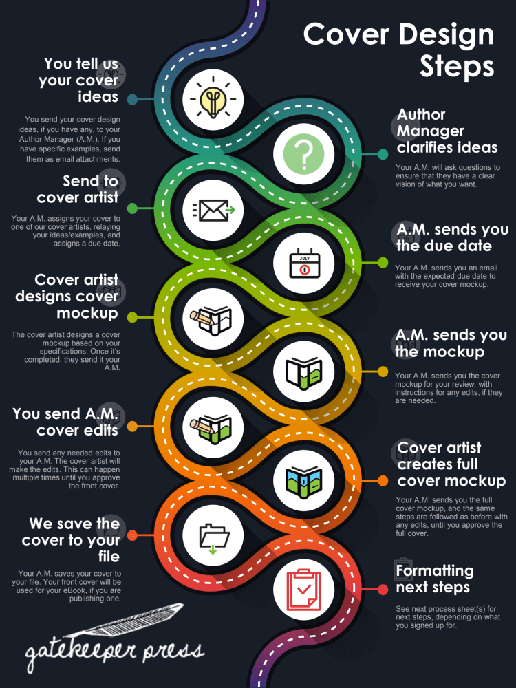
Now that your new book is entering the editing phase it is time to focus attention on its cover design. If you are feeling overwhelmed by the vast realm of book cover design possibilities, you are in ample company. You will find that creating a best-seller book cover requires a combination of artistic talent and careful strategizing. More than that, when it comes to selecting book cover colors that sell best, book cover design becomes a lesson in psychology.
Color impacts us emotionally on a subliminal level. There are even scientific studies on the psychological effects of color in eliciting emotions and mood. For example, you may notice that hospitals routinely use pale green or blue wall paint because these colors induce feelings of calm. Likewise, fire engines are painted red, a color that grabs our attention and evokes a sense of urgency. The psychological effect of color influences many of our daily decisions, like which products we buy…including books.
What is the Best Color for a Book Cover?
Who knew the colors you pick for your cover design would hold such sway? Years of research into color psychology have yielded important connections between a color and the way it makes us feel or react. Therefore, when selecting the best color for your book cover, consider carefully the emotions associated with the following familiar colors:
Blue
Blue is associated with nature—from the soft blue color of the sky to the rich deep blues of the ocean. It is a favorite color to many, as it elicits feelings of calm and serenity. Blue is also seen as a sign of stability and trustworthiness, but also is sometimes associated with sadness.
Green
Green is also associated with nature, such as green trees and lush lawns. The color green evokes a soothing, refreshing, and tranquil state of mind. Green is often equated with a fresh beginning, excitement, vitality, wealth, and even jealousy.
Yellow
Yellow is associated with energy, its attention-grabbing effect, and warmth. The color can evoke a wide range of responses, such as feeling cheerful and happy, or seeing the color as grating and annoying, or even aggressive.
Gray
Gray is a neutral color that is associated with wisdom, sophistication, and also depression. The color gray elicits an emotional spectrum ranging from remote, distant, cool, and bored to serious, focused, and intelligent.
Red
Red is associated with opposing emotional reactions, including both passion and anger. It evokes feelings of love and warmth, power, and desire, but is also known for its dominance and aggression responses.
White
White is associated with purity, cleanliness, and peacefulness. It conveys a sense of safety, simplicity, self-sufficiency, and freshness. White can also come across as stark, bland, or cold.
Orange
Orange is a love it or hate it color associated with playfulness, energy, and attention-grabbing. It can elicit feelings of warmth, confidence, and happiness, but can also be found to be overwhelming and cartoonish.
Pink
Pink is associated with femininity, playfulness, and love. Depending on the shade of pink, this hue can evoke feelings of passion and romance, innocence or childishness, and tenderness.
Purple
Purple is a potent and exotic color associated with wisdom, royalty, bravery, and wealth. The color purple evokes feelings of passion, mystery, intensity, depth, and spirituality.
Black
Black swallows up all the light in the color spectrum, becoming a color without hue. It is a powerful force, associated with death, evil, and unhappiness, but also can feel sophisticated, modern, authoritative, and formal.
What Color Book Cover Sells Best?
When trying to discern which book cover colors sell best, it is important to recognize differences between genres. Each genre will have its own unique vibe, and colors used in book covers within a genre will likely remain loyal to a certain color palette. Of course, you can break outside the pack and try to get noticed by using a totally different color story, but that strategy can be risky.
Color selection should be based first on the genre, and then on the mood or tone of the book. The cover sets the table for what a reader might expect from the content. Using color psychology is a helpful tool for selecting colors that convey the theme or tone of the book. Once you identify your desired tone you will want to pick a palette of two or three complementary or analogous colors that will work nicely with black and white.
Explore How Your Book Cover Color and Design Can Impact Sales
Rather than spinning a color wheel and throwing darts at it, why not chat with the design department at Gatekeepers Press? Our intuitive team of artists will help create a dynamic cover that will communicate exactly the right tone for your book. Reach out today!


